What Makes a Book Cover Sell: Lessons from 22 Published Books
After designing covers for 22 books across three series — spanning fantasy fiction, self-improvement non-fiction, and philosophical essays — certain patterns become impossible to ignore.
1. Genre Signaling Is Non-Negotiable
Before a cover can be "good," it must be correct. A fantasy novel needs to look like a fantasy novel. A self-help book needs to look like a self-help book. Readers make split-second genre judgments based on:
- Color palette: Dark and moody for thriller/fantasy, bright and clean for self-help
- Typography: Serif for literary/historical, bold sans-serif for business/motivation
- Imagery: Characters for fiction, abstract/minimal for non-fiction
- Layout: Busy/detailed for genre fiction, clean/spacious for premium non-fiction
Break these conventions and readers scroll past — not because the cover is ugly, but because it doesn't register as "for them."
2. Thumbnail Readability Is Everything
On Amazon, your cover is viewed as a thumbnail roughly 150 pixels wide. At that size:
- Fine details disappear
- Thin fonts become unreadable
- Complex compositions become visual noise
- Contrast is everything
Design for the thumbnail first. If it doesn't work at 150px wide, nothing else matters.
3. The Title Must Be Legible at a Glance
This sounds obvious, but it's the most common mistake. The title should be:
- The largest text element
- High contrast against the background
- In a font that's readable, not decorative
- Positioned where the eye naturally lands
4. Color Contrast Drives Clicks
The covers that perform best on Amazon have strong color contrast — a bright element against a dark background, or a bold title against a muted image. This contrast is what catches the eye during a scroll.
5. Consistency Sells Series
When a reader sees 5 covers that clearly belong together, the implicit message is: "This is a complete, professional body of work." That consistency — in color, typography, composition, and style — is one of the strongest conversion drivers for series sales.
These principles guide every cover we create at Metronagon.
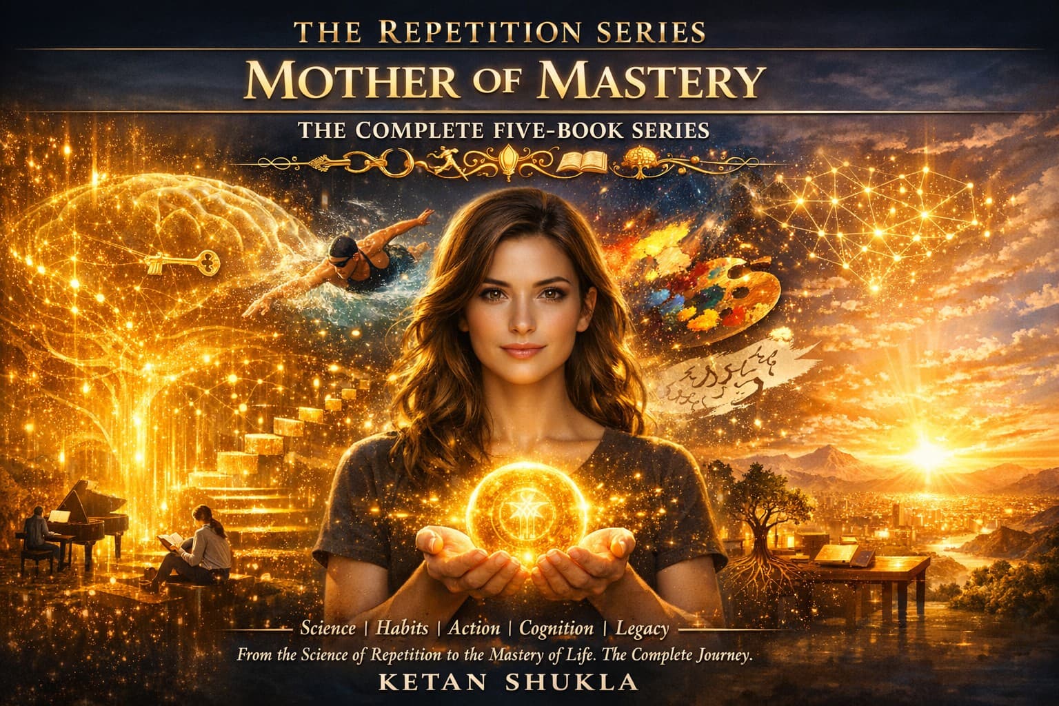
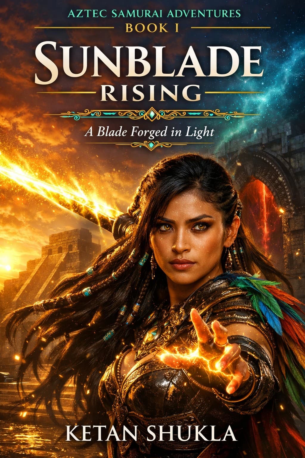
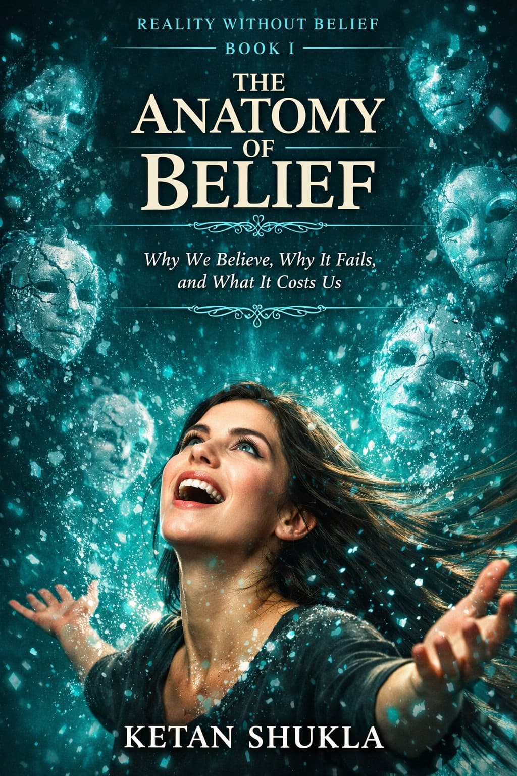
Genre Signaling in Action — Three Different Genres
Fantasy (dark, cinematic, character-focused), Self-Improvement (clean, bold, aspirational), Philosophy (minimal, contemplative, abstract). Same creator, completely different visual language — because genre dictates design.


Consistency Sells Series
When a reader sees covers that clearly belong together, the message is unmistakable: this is a professional, complete body of work.